【簡単】画像の上に、文字を重ねる方法【HTMLとCSS】
と悩んでいる方に向けて、今回は「画像の上に、文字を重ねる方法」について紹介します!
この記事を書いている僕は、現在大阪のWEB制作会社で、WEBサイト制作をしています。
当ブログを通して、あなたは「画像の上に、文字を重ねる方法」について理解することができますよ!
実務でもよく使う実装なので、是非習得してみてください〜!
目次
【簡単】画像の上に、文字を重ねる方法【HTMLとCSS】
今回実装するのはこちら!
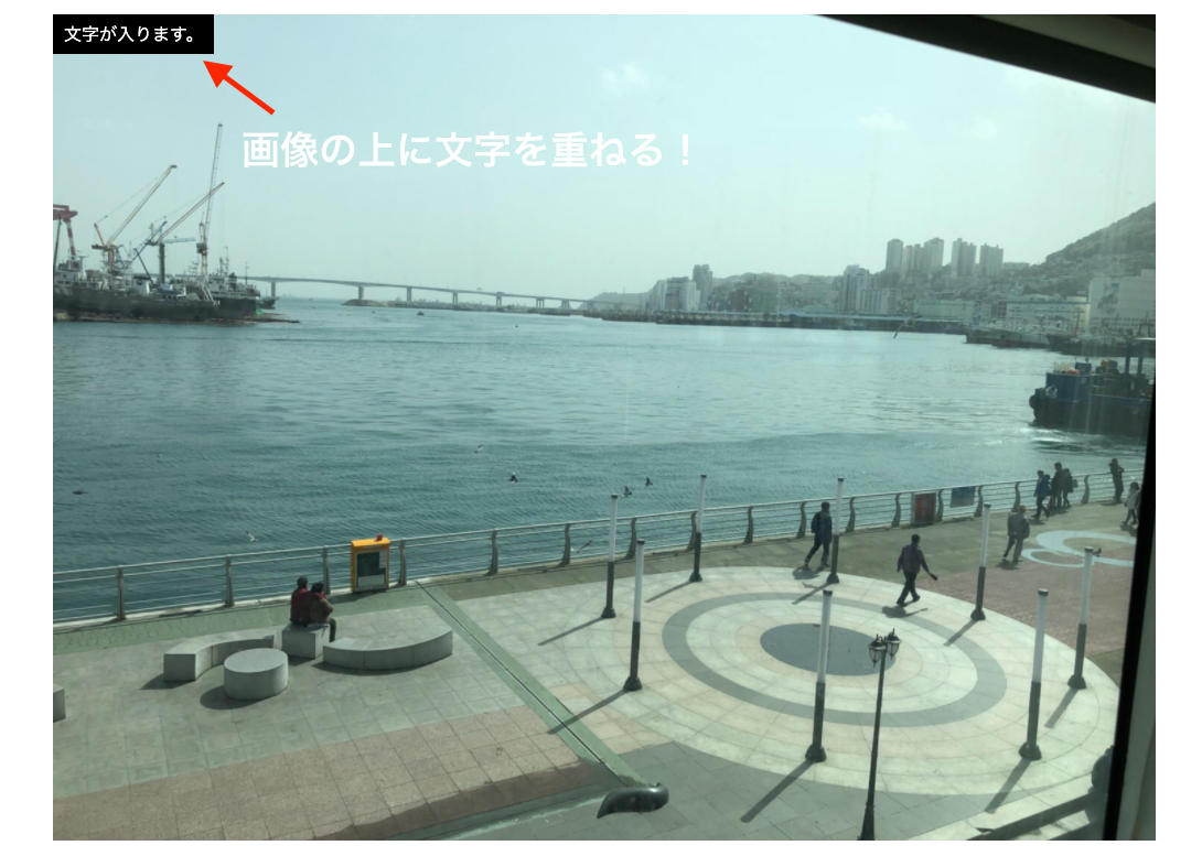
画像の上に文字を重ねる方法は、以下の3つのステップです。
① 画像を表示する
② 文字を表示する
③ 画像の上に文字を重ねる
1つずつ紹介していきますね!
① 画像を表示する
まずは画像を表示しましょう!
コードはこちらになります。
<!DOCTYPE html>
<html lang="ja">
<head>
    <meta charset="UTF-8">
    <meta name="viewport" content="width=device-width, initial-scale=1.0">
    <link rel="stylesheet" href="css/main.css">
    <title>画像の上に文字を重ねる方法</title>
</head>
<body>
    <div class="box">
        <img src="./image/bg.jpeg" alt="">
    </div>
</body>
</html>
「.box」というclassの中に、imgタグで画像を表示しました。
② 文字を表示する
次に、画像の上に表示させたい文字を表示しましょう!
<!DOCTYPE html>
<html lang="ja">
<head>
<meta charset="UTF-8">
<meta name="viewport" content="width=device-width, initial-scale=1.0">
<link rel="stylesheet" href="css/main.css">
<title>画像の上に文字を重ねる方法</title>
</head>
<body>
<div class="box">
<img src="./image/bg.jpeg" alt="">
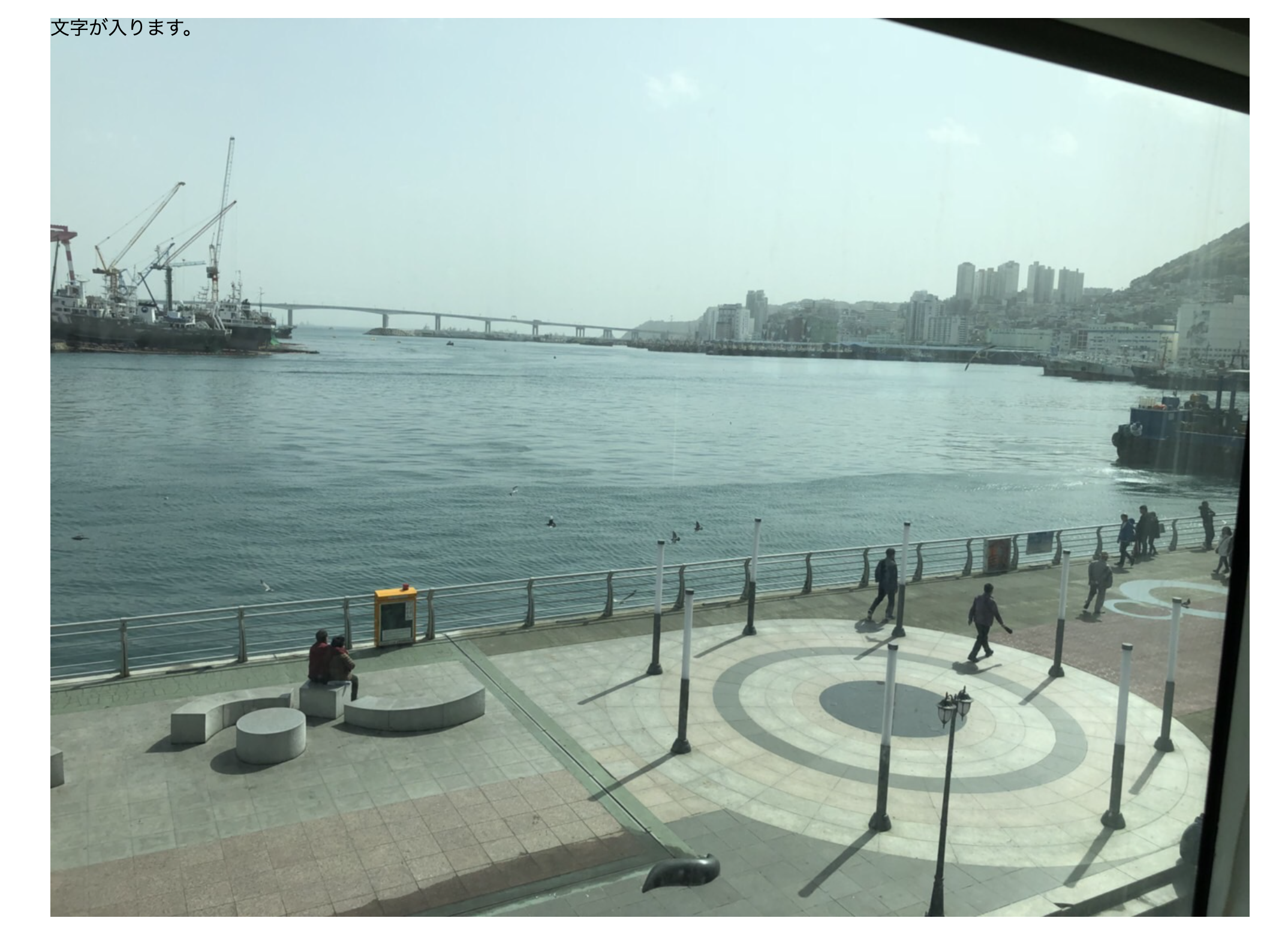
<p>文字が入ります。</p>
</div>
</body>
</html>
imgタグの下に、pタグを用意しました。
③ 画像の上に文字を重ねる
画像と上に重ねたい文字が揃いました。
これから実際に画像の上に文字を重ねる実装をしていきます!
今回使うプロパティは、「position」プロパティです。
positionを使うことで、要素の位置を決めることができる。
まずは親要素である「.box」に「position: relative;」を指定しましょう!
.box {
    position: relative;
}
これで要素の基準値を決めました。
次に、画像の上に重ねたい文字である「pタグ」に「position: absolute;」を指定しましょう!
absoluteは、親要素を基準に、絶対的な位置を決めます。
.box p {
    position: absolute;
    top: 0;
    left: 0;
}
そして「topから0px」、「leftから0px」を指定することで、文字を左上に配置しました。
これで、画像の上に文字を重ねる実装が完了です!
あとはお好みで文字の装飾を変えるなりしてください。
画像の上に文字を重ねる実装のポイントは、重ねたい文字の親要素に「position: relative;」、そして重ねたい文字に「position: absolute;」を指定することです!
まとめ
以上が、「画像の上に、文字を重ねる方法」についてでした!
制作の現場でもよく使う実装なので、是非参考にしてください!
そして、最後に今回使ったHTML・CSSの全体のコードを貼っておきますね。
HTML
<!DOCTYPE html>
<html lang="ja">
<head>
    <meta charset="UTF-8">
    <meta name="viewport" content="width=device-width, initial-scale=1.0">
    <link rel="stylesheet" href="css/main.css">
    <title>画像の上に文字を重ねる方法</title>
</head>
<body>
    <div class="box">
        <img src="./image/bg.jpeg" alt="">
        <p>文字が入ります。</p>
    </div>
</body>
</html>
CSS
/* ◎リセットCSS */

/*
html5doctor.com Reset Stylesheet
v1.6.1
Last Updated: 2010-09-17
Author: Richard Clark - http://richclarkdesign.com
Twitter: @rich_clark
*/
html, body, div, span, object, iframe,
h1, h2, h3, h4, h5, h6, p, blockquote, pre,
abbr, address, cite, code,
del, dfn, em, img, ins, kbd, q, samp,
small, strong, sub, sup, var,
b, i,
dl, dt, dd, ol, ul, li,
fieldset, form, label, legend,
table, caption, tbody, tfoot, thead, tr, th, td,
article, aside, canvas, details, figcaption, figure,
footer, header, hgroup, menu, nav, section, summary,
time, mark, audio, video {
    margin:0;
    padding:0;
    border:0;
    outline:0;
    font-size:100%;
    vertical-align:baseline;
    background:transparent;
}
body {
    line-height:1;
}
article,aside,details,figcaption,figure,
footer,header,hgroup,menu,nav,section {
    display:block;
}
nav ul {
    list-style:none;
}
blockquote, q {
    quotes:none;
}
blockquote:before, blockquote:after,
q:before, q:after {
    content:'';
    content:none;
}
a {
    margin:0;
    padding:0;
    font-size:100%;
    vertical-align:baseline;
    background:transparent;
    text-decoration: none;
}
/* change colours to suit your needs */
ins {
    background-color:#ff9;
    color:#000;
    text-decoration:none;
}
/* change colours to suit your needs */
mark {
    background-color:#ff9;
    color:#000;
    font-style:italic;
    font-weight:bold;
}
del {
    text-decoration: line-through;
}
abbr[title], dfn[title] {
    border-bottom:1px dotted;
    cursor:help;
}
table {
    border-collapse:collapse;
    border-spacing:0;
}
/* change border colour to suit your needs */
hr {
    display:block;
    height:1px;
    border:0;
    border-top:1px solid #cccccc;
    margin:1em 0;
    padding:0;
}
input, select {
    vertical-align:middle;
}
* {
  box-sizing: border-box;
}
img {
  max-width: 100%;
  height: auto;
}

/* ◎リセットCSS */

◎画像の上に文字を重ねる実装についてのコード

body {
    max-width: 1000px;
    margin: 0 auto;
    padding: 20px 0;
}

.box {
    position: relative;
}

.box p {
    position: absolute;
    top: 0;
    left: 0;
    padding: 10px;
    background-color: #000;
    color: #fff;
}
大阪のWEB制作会社で働くコーダー。コーディングにハマり、気づいたらWEB制作を仕事にしていました。現在は新規のWEBサイト制作やWordPressカスタマイズしたり、当技術ブログを運営しています。